Strange by Design: Inside the Color and Cinematography of Widow’s Bay
Cinematographers Christian Sprenger and Cody Jacobs and Harbor Supervising Colorist Damien Vandercruyssen break down the film-inspired photography, coastal patina, and evolving color language behind the Emmy-winning series, Widow’s Bay.
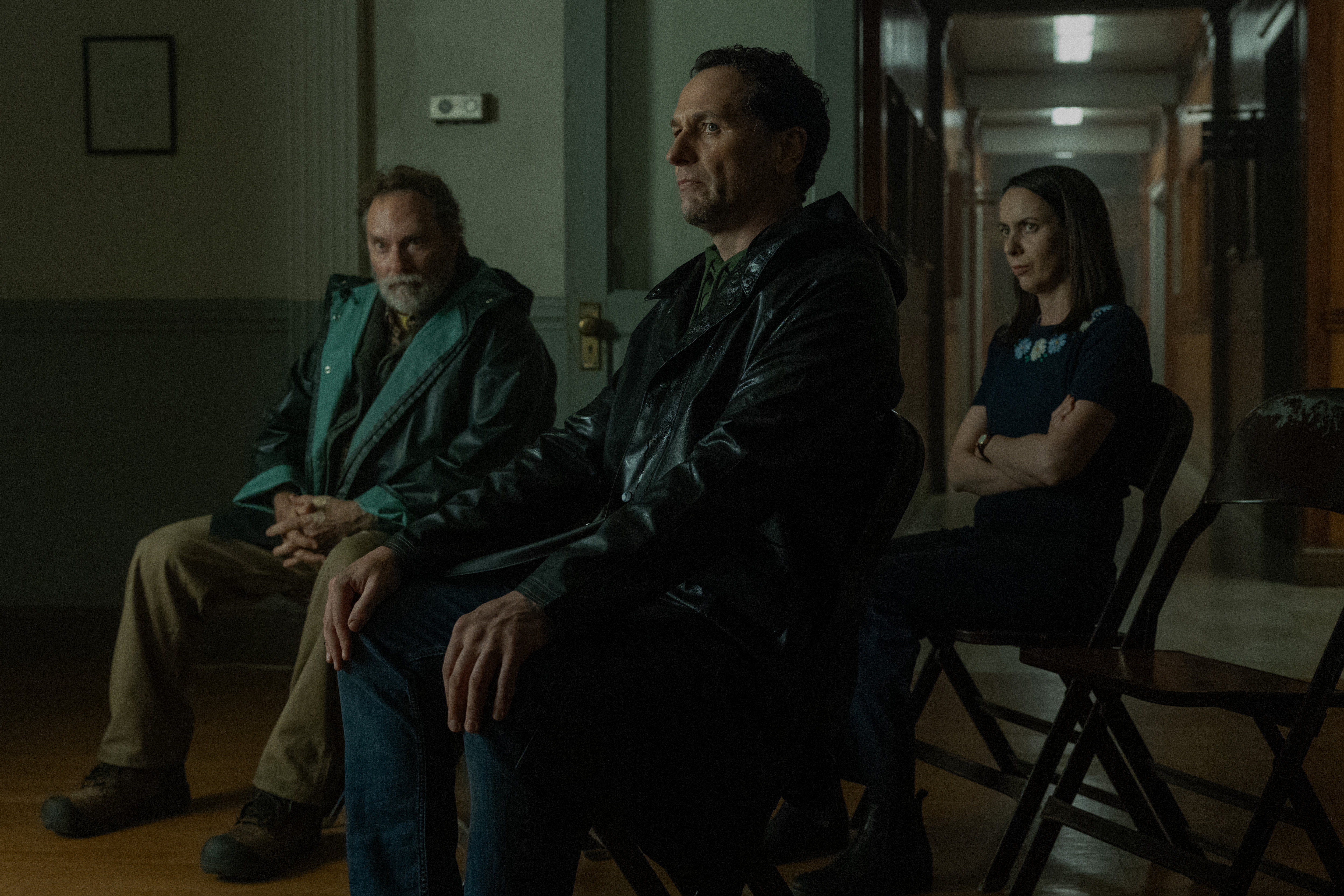
Widow’s Bay exists somewhere between the familiar and the strange. Its island can be warm and inviting one moment, then isolated and quietly threatening the next. Comedy slips into horror, quaint landscapes take on an unexpected chill, and the series carries the texture of another era without ever fully revealing exactly when that era might be.
That ambiguity was built into the image from the beginning.
For cinematographers Christian Sprenger and Cody Jacobs and Harbor Senior Colorist Damien Vandercruyssen, creating Widow’s Bay meant developing a visual language that could move between absurdity, mystery, and genuine darkness without losing its identity. Drawing heavily from film photography of the 1970s and 80s, the team built a look around texture, naturalism, and restraint, deliberately moving away from anything that felt overly clean, modern, or polished.
The result is a world with a distinct visual character: weathered but rich, nostalgic without belonging to a specific era, and beautiful without ever becoming too comfortable.
Building an Island Outside of Time
For Sprenger and Jacobs, Widow’s Bay built on a creative relationship stretching back nearly two decades, beginning with their years working together as cinematographer and gaffer. Vandercruyssen later joined that creative partnership on Mr. & Mrs. Smith, establishing a shared visual shorthand that carried into Widow’s Bay.
“This was really the first time that we got to technically co-author the look of the show,” Sprenger says.
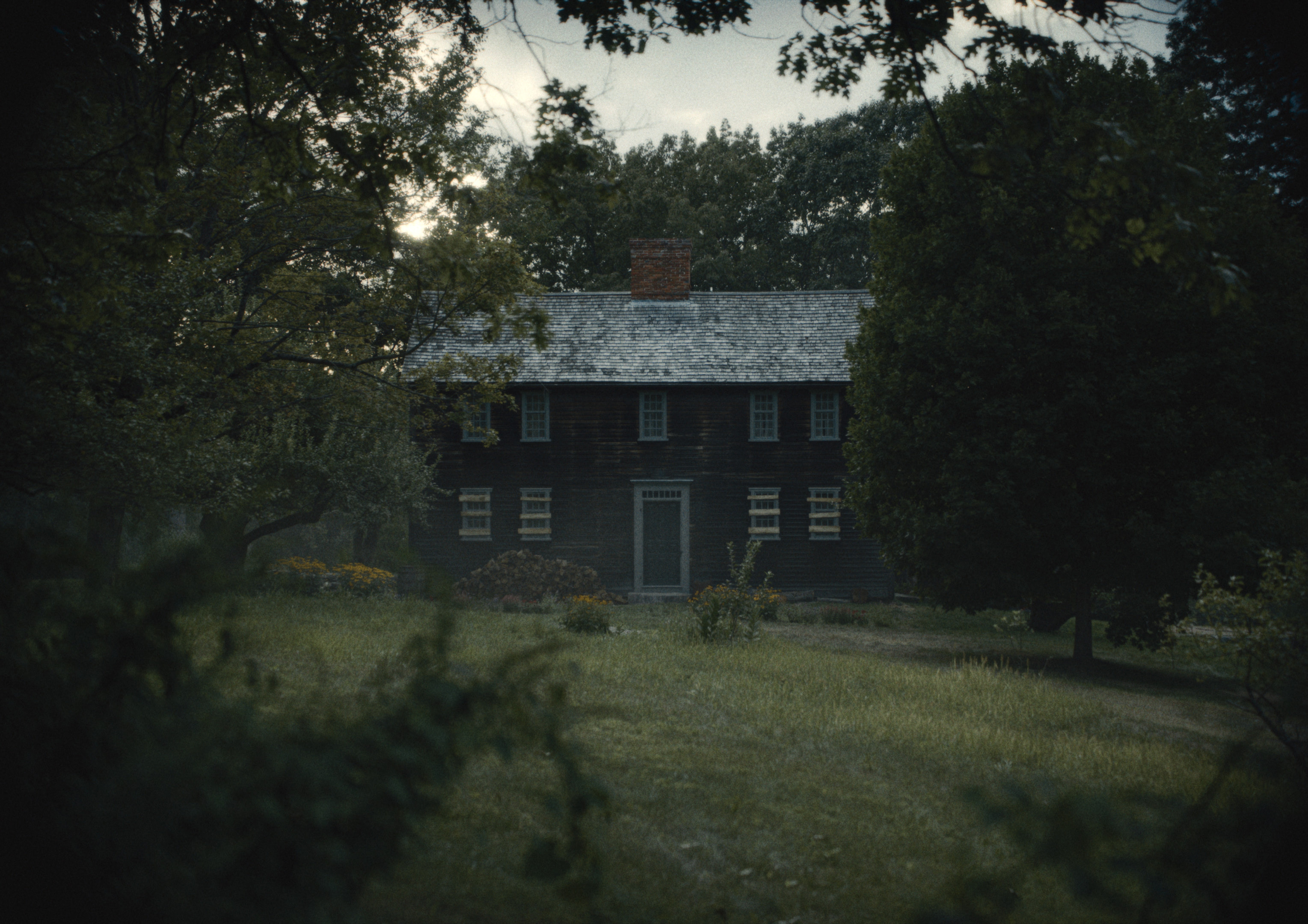
That shared visual instinct became particularly important because there was no single ‘Widow’s Bay’ to photograph.
“We basically pieced the island together with a million little jagged-edge puzzle pieces,” Sprenger says. “Then our incredible art department was the glue that assembled what now feels like a real island.”
Before cameras rolled, Sprenger and Jacobs began constructing that island visually through an expansive shared reference board. Rather than anchoring the series to a handful of films, they collected imagery around ideas: fog, night exteriors, interiors, color, lighting, texture, and atmosphere.
“You could zoom out and just see this palette of things,” Jacobs says. “It became this mood board divorced from specific references. Looking at it now, it’s kind of amazing how close it is to what eventually came out.”
Films photographed in the 1970s and ’80s became an important touchstone. When those references reached Vandercruyssen, one in particular helped crystallize the larger direction.
“Jaws made the most sense to me for the world and the aesthetic,” Vandercruyssen says. “There were all these references to the late ’70s and ’80s that felt very much in line with the production design. But they didn’t want it to be a pure match. It still needed to be original.”
The goal was never to recreate a particular period. Instead, the team borrowed the texture and character of those references to create an island that feels strangely untethered from time.
From Film Stock to Coastal Patina
Rather than describing the desired image as “filmic,” the filmmakers gave themselves a physical benchmark.
During camera testing, Sprenger photographed material side-by-side on Kodak 5219 and the ARRI Alexa 35. The tests were brought to Vandercruyssen at Harbor, where the team first established the look using the film photography and then translated those characteristics to the digital image.
“We graded the film to look like what they wanted,” Vandercruyssen explains, “and then matched the digital to the film we liked.”
That process became the foundation of the show LUT. Grain, halation, highlight behavior, and even frame jitter were developed around the film tests.
“If we were shooting on film, this is exactly what we would want it to look and feel like,” Sprenger says. “Damien and the Harbor team basically built a LUT that translated those things over to our shooting LUT.”
The look then stayed with the production through dailies and offline edits, allowing everyone to experience Widow’s Bay through its intended visual language from the beginning.
“It was our mission statement,” Sprenger says. “The ‘not digital, not modern, not slick’ idea was sort of baked into the soul of the project since the beginning.”


For Vandercruyssen, establishing that foundation early allowed the LUT to behave almost like a film stock. Sprenger and Jacobs could light according to the image they were seeing on set rather than expecting the final DI to fundamentally reinvent it later.
The team went through three rounds of testing to establish the look. Then production presented an unexpected challenge: New England summer.
Many of the original locations had been scouted during winter and early spring, when the landscape naturally carried the weathered quality the filmmakers imagined. Production stretched from May through September, when those same locations became intensely green and lush.
“You get there in the summer and everything is in full bloom,” Jacobs says. “You have to wrap your head around how to make the island feel ominous when flowers are everywhere and the trees are all green.”
Sprenger remembers seeing the early photography and calling Vandercruyssen.
“I was getting these initial images back and the greens looked so insanely bright and happy,” he says. “I was like, ‘We gotta get rid of the green.’”
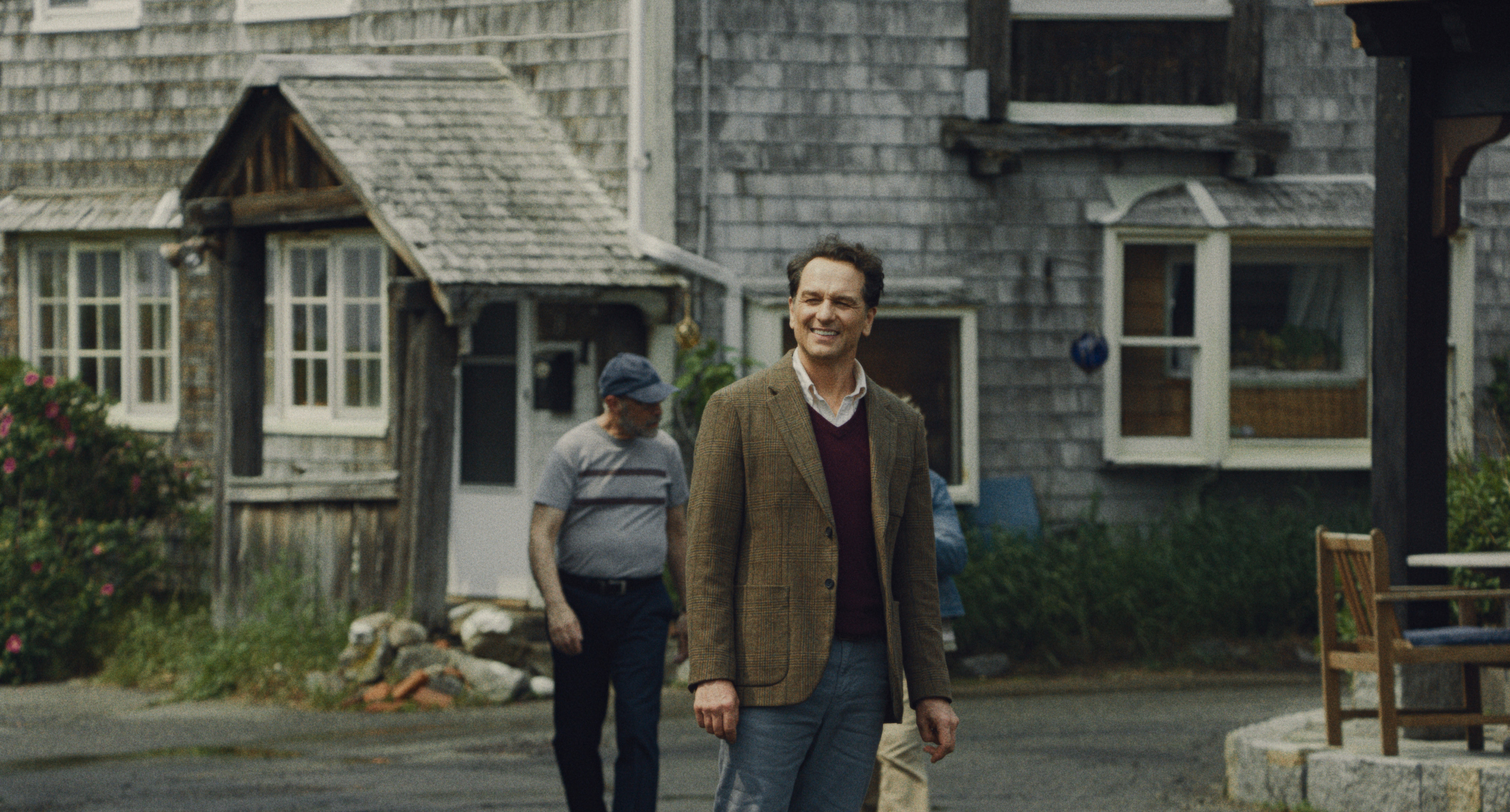
They tempered that lushness without draining the island of life. Blues could remain bold and skin tones were carefully protected, while the surrounding palette took on what Sprenger describes as a “coastal patina.”
Vandercruyssen introduced a subtle green bias into the highlights and restrained the saturation, creating something slightly weathered and vintage without distorting the colors of the costumes or production design.
“It plays with the fact that you don’t exactly know when it’s taking place,” Vandercruyssen says.
That uncertainty became fundamental to the series. Widow’s Bay never recreates the past. It simply never feels entirely tethered to the present.

Finding Darkness Without Losing the Comedy
The same restraint carried into the lighting.
At night, Sprenger and Jacobs embraced the island’s isolation. Rather than filling the horizon with moonlight, distant buildings, or environmental detail, they imagined Widow’s Bay as far enough removed from the mainland that darkness could simply take over.
“We started thinking about the idea that the island was set away from the rest of the world and secluded,” Sprenger says. “There’s something extra spooky about that.”
Night exteriors became isolated pools of illumination surrounded by blackness.
“It’s almost like you have these little diorama scenes,” Sprenger says, “in the middle of the woods, or outside of a haunted house, or outside of the Salty Whale at night.”
For Jacobs, photographing the series on the water reinforced the approach.
“We were interested in leaning into the blackness of what the ocean would be at night,” he says. “Not trying to get too romanticized about seeing clouds and a full moon and moonlight.”
The real ocean confirmed that instinct. Beyond the boat were reflections, fragments of light, and then nothing.

That darkness, however, couldn't overwhelm the other half of the show's identity: Widow’s Bay is funny.
“We were sort of anti leaning into the spooky too much,” Jacobs says.
Rather than relying on familiar horror shorthand, the filmmakers let individual scenes dictate how far the image could move toward genre. Vandercruyssen describes the process as a constant push and pull.
“You’re always leaning towards something, but you always have to pull back,” he says. “The look is pretty strong, but I think it also works because of that variety.”
At times, the established rules could stretch significantly. In Episode 4, Jacobs and Vandercruyssen worked to create a deep crimson red that felt cinematic rather than electronically saturated.
“Red is one of the hardest things on digital to make look not weird and electric and neon,” Jacobs says. “Damien helped us get to a place that looked like kind of a filmic, crimson red to me.”
Episode 2 provided another opportunity to push. During a flashlight-driven hotel sequence, Vandercruyssen took the HDR image further than usual, deepening the blacks and intensifying the highlights until the single light source became almost aggressive.
For Vandercruyssen, the hotel became one of the clearest expressions of the series' overall palette.
“It has that slightly toxic yellow-green,” he says. “All the colors are a little unwelcoming. It’s always on the edge.”
The key was allowing Widow’s Bay to become strange without forcing every strange moment to become frightening.

Episode 6: Reinventing Widow’s Bay
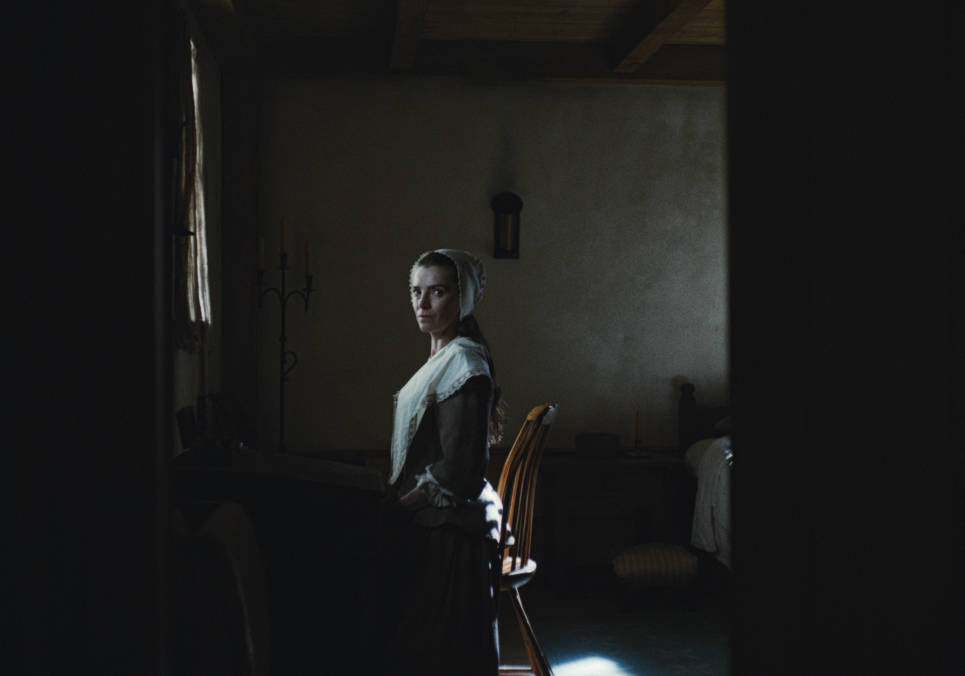
Nowhere did the filmmakers push their visual language further than Episode 6, the flashback episode for which Sprenger won the Emmy for Outstanding Cinematography.
The episode needed to clearly depart from the contemporary story while remaining unmistakably part of the same world. Neither Sprenger nor Vandercruyssen wanted to fall back on the familiar language of the sepia-toned or generically desaturated flashback.
Sprenger instead created a separate collection of visual and color references specifically for the episode.
“We had a session, just the two of us, where we were like, ‘Let’s almost totally reinvent this,’” Sprenger says. “We wanted it grounded in the overall cinematic universe that is Widow’s Bay, but we still wanted it to feel elevated and different and a little bit in its own world.”
The photography itself opened that door. The episode used a different camera, vintage lenses adapted for the production, and a different aspect ratio. In the DI, Vandercruyssen began with the established Widow’s Bay language and pushed it toward a bleach-bypass influence.
The palette became dustier and more restrained, while candlelit scenes allowed the team to explore more monochromatic imagery than was possible in the contemporary timeline.
“We pushed the look that we had in the modern day, but had a little more of a dustier look,” Vandercruyssen says. “We played with a lot of candle scenes and more monochromatic palettes that we couldn’t do in the modern-day stuff.”
For Sprenger, the final transformation came together in the grade.
“Damien came up with some really interesting, weird color ideas,” he says. “I think that completely changed the feeling of that episode.”
The episode became proof that the rules they had spent so much time establishing could be broken without abandoning the identity underneath them. Continuity didn't have to mean sameness. The image could become older, dustier, and stranger while still unmistakably belonging to Widow’s Bay.

Knowing When to Leave the Image Alone
That balance between precision and freedom extended through the entire series.
Jacobs describes naturalism as foundational to how he and Sprenger approach photography. Anything that looked conspicuously lit tended to work against their instincts. But making an image feel natural required considerable control behind the scenes.
“It’s always kind of a funny, weird backhanded compliment when someone says, ‘It’s amazing that you shot this thing with probably no lighting,’” Sprenger says. “Actually, I think to make something feel naturally lit or unlit takes an enormous amount of lighting and planning.”
Practical lighting was built into sets. Windows, doors, fixtures, and lighting positions were coordinated with the art department. Exterior work required careful planning around weather and sun direction.
The goal wasn't to relinquish control. It was to prevent that control from becoming visible.
Vandercruyssen approached the final grade with the same philosophy.
“It’s never quite a perfect match,” he says. “You keep it loose.”
Skin tones still needed continuity, and the overall look had to translate across deliverables. But not every subtle difference between angles needed to be corrected simply because the tools existed to correct it.
“We always try to keep enough looseness so it’s not perfect,” Vandercruyssen says. “We want to preserve the feel more than the exact match shot by shot, losing the little magic that we find when it’s not quite perfect.”
It meant fewer unnecessary windows and keys, and resisting the temptation to polish the personality out of the photography.
“For us, it’s about trusting the foundation we’ve built,” Vandercruyssen says. “Once the look is there, you can let the image breathe and focus on preserving what makes it feel special.”
That philosophy may ultimately explain why Widow’s Bay can move so freely between tones without losing itself.
Its identity isn’t defined by a single palette, reference, or technique. It comes from the tension between them: the texture of film applied to digital photography, beautiful summer landscapes pulled toward something colder, deep ocean blacks against absurd comedy, and a contemporary world that somehow feels removed from the present.
The filmmakers established the rules early enough to know exactly when they could break them.
And that is what allowed Widow’s Bay to be strange by design.

