STYLIZED REALITY: TELLING ROB PEACE’S STORY IN COLOR & SOUND
Written by Ellie Powers
Based on the biography The Short and Tragic Life of Robert Peace by Jeff Hobbs, Rob Peace is the latest project from Director/Actor Chiwetel Ejiofor. The film tells the true story of Robert Peace, an inner-city Newark kid who attends Yale yet ultimately succumbs to harsh economic realities and the demons of his past.
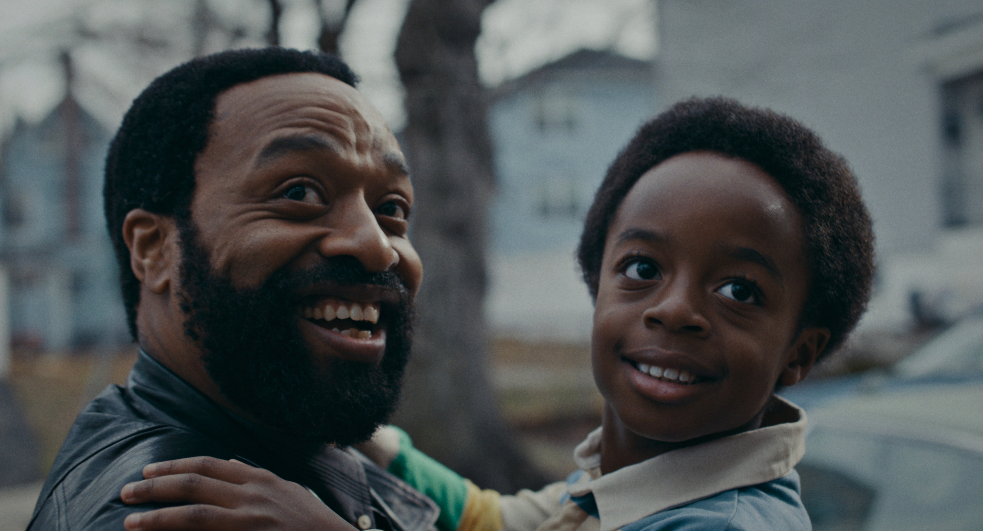
When adapting nonfiction for the screen, Ejiofor’s style walks the line between atmospheric and verité to craft a story that pulls its weight as an artistic endeavor and as a wider commentary on society. The film resides manly in two worlds – East Orange, New Jersey and Yale University – and spans several decades from the 1980s to the 2010s.
The look, guided by Harbor Senior Colorist Roman Hankewycz, was crafted scene by scene, while the soundscape, championed by Supervising Sound Editor Bob Hein and Re-Recording Mixer Josh Berger, was more dependent on location and emotion.
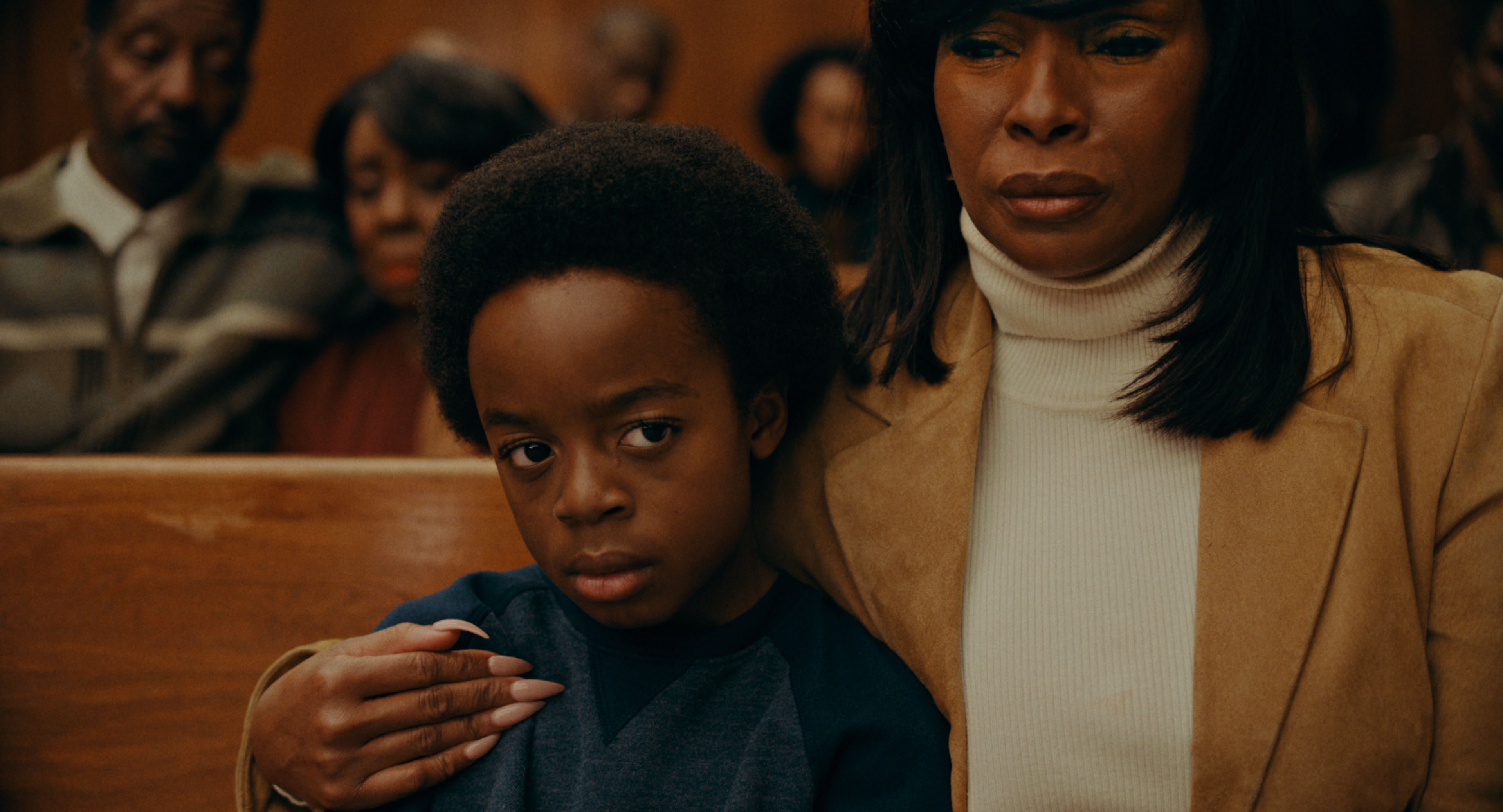
Hein recalls how Ejiofor was heavily involved in the sound finishing process and had a clear vision for “East Orange to be a chaotic, lively, noisy neighborhood, active and a bit dark, while Yale is a cloistered, sanitized environment,” notes Hein.
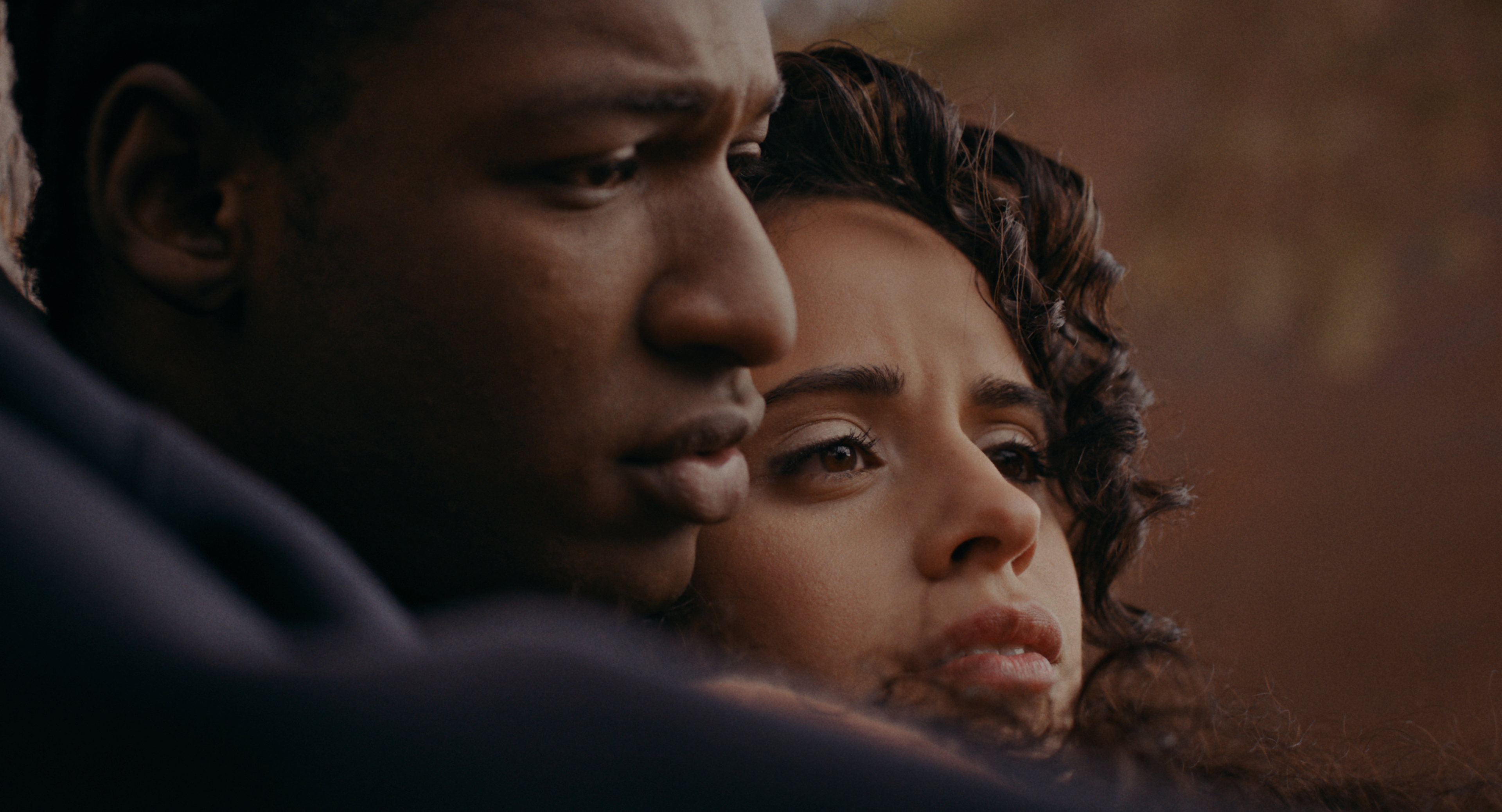
Following Ejiofor’s direction, the sound team focused on the finer, more subjective details of the mix. For example, in a pivotal scene (no spoilers) where Rob and Naya are seated under a tree during a quiet, emotional moment, Berger discussed how they integrated a more abstract cue to show how, “when Rob closes his eyes, the sound of the cars becomes the sound of waves. Bob [Hein] did this amazing thing where, when the car goes over a puddle, it feels like a wave, and mirrors the wave of emotion he finally reveals to Naya. It’s all stylistic.”
The motif of water permeates the film and for the mix, Hein incorporated “the same sound design from earlier in the film throughout, so that the water sounds grew as the film goes on.”
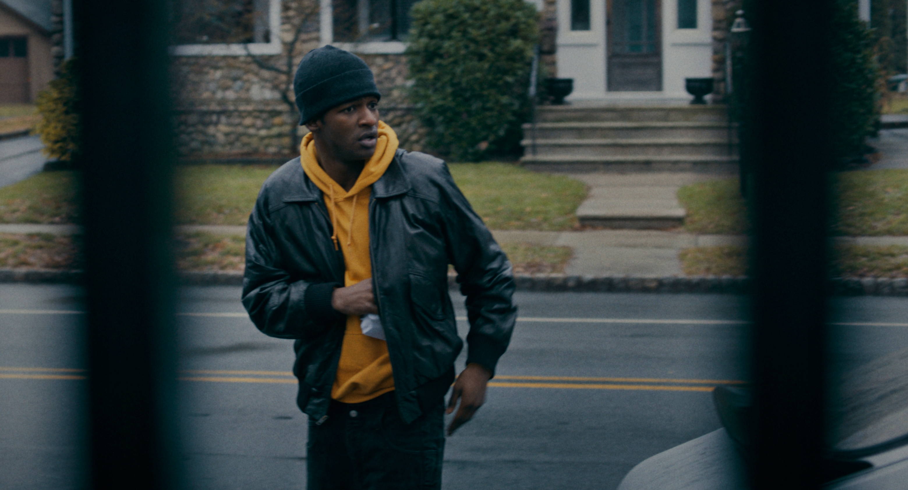
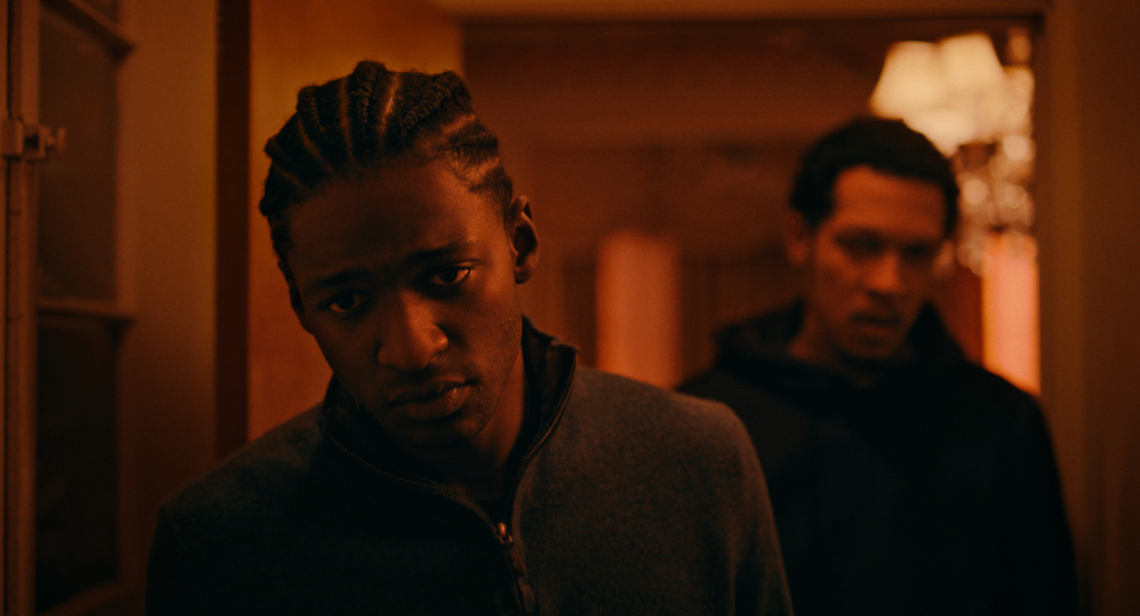
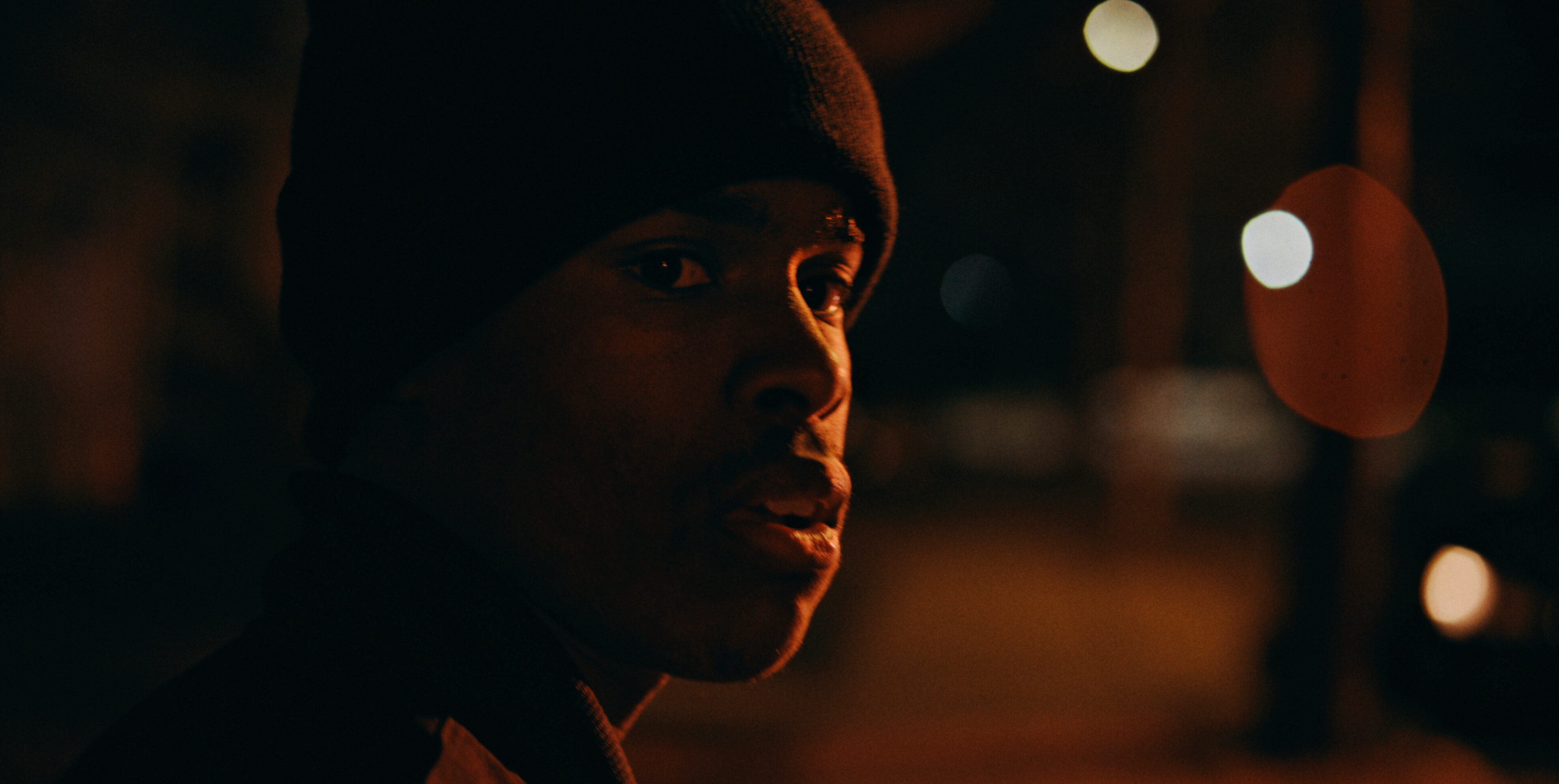
For the look, Cinematographer Ksenia Sereda, Ejiofor, and Hankewycz approached each scene with the goal of finding its unique and interesting look instead of strictly adhering to looks based on location or period. The overall palette leaned warm, into oranges and reds, and from the beginning Sereda wished to lean heavily into a style motif of “shadow-light play where the faces are just on that edge of being too dark with a bold red light that pierces through, creating an intense looking image,” Hankewycz said.
The film was shot on an Alexa 35, and it was the first time that Hankewycz had seen footage from that camera. Sereda and Hankewycz marveled at “what was captured. If this had been shot with an earlier Alexa or any other camera, it wouldn't have looked exactly the same. It had an interesting quality that was somehow different in a very subtle way that’s hard to describe,” Hankewycz recalls.
They developed two LUTS for use on set, Hankewycz explains, “one that was more of a daytime vibe, more straight up, and another which was intended for nighttime shots and was supposed to be dark and gritty, almost contaminated, mimicking sodium vapor.”
In the DI, Hankewycz continues, they decided to “use the nighttime LUT for the whole film. It turned out that that nighttime LUT had a funkiness that worked so much better for the film overall. The daytime look worked well for dailies, because it was clean and gave a good impression of what was shot, but during DI, we realized that the nighttime LUT was more visually interesting.”
Rob Peace will be playing in select
theaters on Friday, August 2.
